Saturday, February 28, 2009

Day Two Requested Tutorial

Okay so today we get to build our page in photoshop and also we get to learn how to cut things.

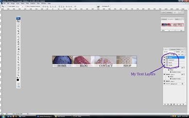
Here is our image for the day:
b

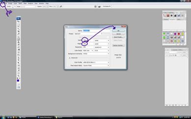
First we want to make a new document. So you are going to make it 750x whatever the number you want it to be. The reason why we use 750 is because it is the size of most standard monitors for people who have not yet switched to widescreen which is like 65% of America last time I checked (which was a year ago) In this case mine is 750x1000.
1

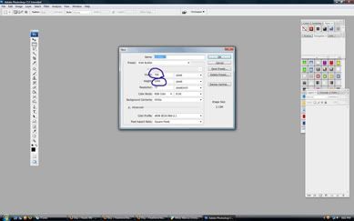
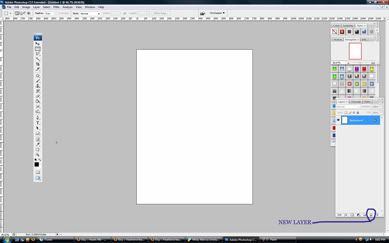
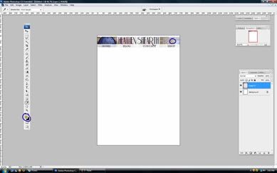
From here we go ahead and make a new layer and save our document in the "source" folder we created yesterday.
2

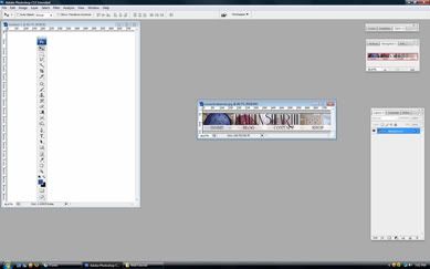
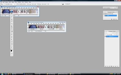
Alrighty lets get out web header/banner that we made yesterday open and drag it into our new document.
3

If you followed my format yesterday everything fits like a hand in a glove...hmm I should probably use a better analogy. Anyway from here we want to select the eye dropper tool. Our banner lets us know the colors we need and the style we want to follow while building the rest of our page.
5

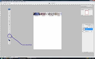
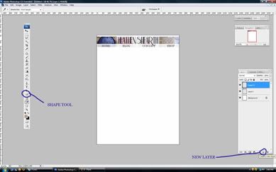
From here lets select a color from our web header/banner. The good thing about this is that you are using colors that already exist in the document to make it stand out more for the web.
6

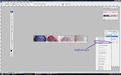
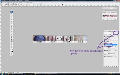
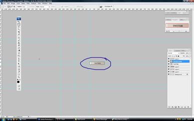
Now from here you can put in a shape with that color. Make sure to make a new layer so that you can keep everything seperate and perfect for moving and saving purposes.
7


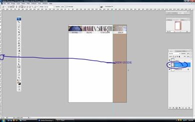
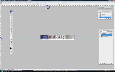
I personally know that on the sides of this website I would prefer to have feeds from other websites. So I take the time to make space for them. I start of by making a guide line. You can make a guide line by:
clicking and dragging on the rulers on the side of your photoshop document.
If you dont not have your rulers open you can go to the "view> rulers"
or you can hit
ctrl+r to bring them up
From here I draw my shape on my guide line to make sure it looks perfect.
8

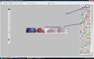
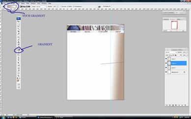
Now this is a decision you have to make on your own. Do you like the shapes placement? Is the color to dark or murky? In my case this brown although looks tasty but is too dark for what I need. I grab the gradient tool and fade it into the background. You can leave your bar the way you want it or nit pick as much as you like. I am not rushing you in this tutorial :D
If you use a gradient notice that in the top left hand side a new panel will come up showing your gradient colors. To pick a new one or change your gradient you can double click on that open window.
9

With everything all fancy looking and pretty lets open up that new image I provided for you and drag it into our document.
10

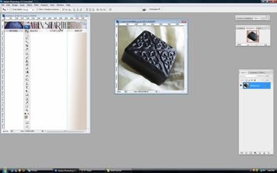
Our reason for this extra image is to keep the page from being too plain jane. Sure its fine to just want a banner and a color but does it really define you?

11

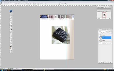
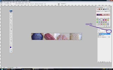
From here I free transform the layer to a bigger scale and match it to my guide line that I made earlier and then fade the opacity. If all of what I just said to you was a jumble you should probably start off with my other tutorials:
12

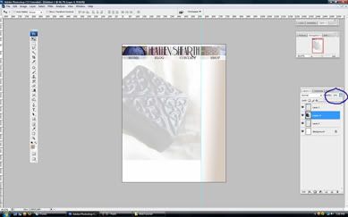
Alrighty from here I make a few side bars our rectangles to represent spots that will be filled and what wont. In the process I use guides to cut my image. Make sure your guidelines fit the way you want the site broken up. Tomorrow we will be using tables and its important to follow your guides.
13

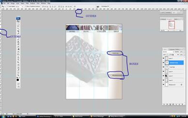
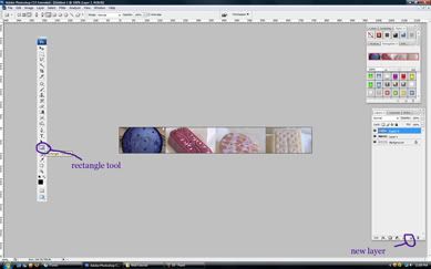
Okay with our guidelines drawn lets select the rectangle marquette tool from the tool bar.
14

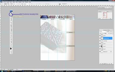
We are going to use this guy to help select just the sections we need for saving out. For the demo I selected a larger section to show everyone the break down. I would suggest not cropping the banner though get everything below it. Make a box with the tool that follows your guides. SAVE NOW just incase of accidents. Now click "image > crop" and lets get this baby down to size.
15

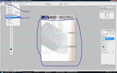
Continue to crop the image or do a single crop depending on how you follow this tutorial and lets get down to those little bars on the side.
16

17

18

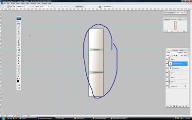
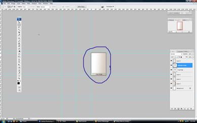
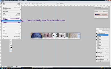
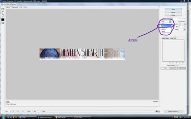
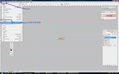
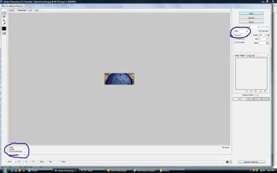
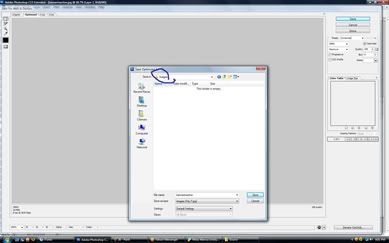
Now that we have gotten down to just this little guy lets learn how to save things out for the web. Click " file > save for web"
19

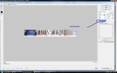
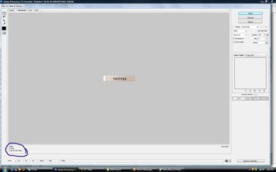
Remember how yesterday we set everything to maximum? Yeah lets not do that today. The reason why is because in the left hand bottom corner we can see a set of numbers that tell us how long something will load on the web. When it comes to websites this is very important.People dont want to wait for 3 seconds for an image to load. So lets take this guy down a huge notch.
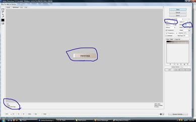
For text and simple colors 98% of the time you can turn it into a "gif" which you probably saw on the drop down menu yesterday. You can also you "png8" or if actually using a "jpg" is quicker use that format.
20
The resolution of the image will continously change depending on what you select. Just like with a jpeg you can change the level of quality with a gif or png8. The selection for this is in color numbers though. There are 256 visual colors on the web and you can pick anywhere from 1-256 to get your image down to size. Remember though we dont want to give up quality for time either so lets make sure this guy looks good but loads quick.
21
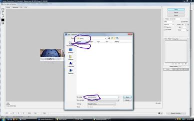
From here cut up the rest of that side bar and save out the little boxes and the side panel. All of these guys should be saved in our "images" folder that we made yesterday and named accordingly to what they are.

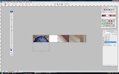
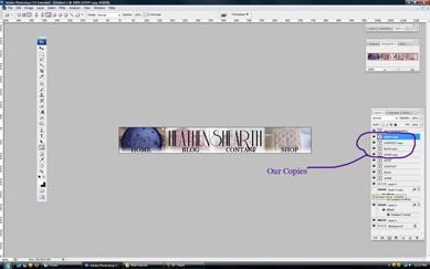
NOW! Lets move on to our banner and cutting it. Remember yesterday how i had you save out both banners? Well this is why. Open up both banners and lets drag on into the others window:
22

Lets make sure they are even and lets start to draw our guide lines for cropping on them. In my case I split the banner into 4 across and 2 up. If you made a funky shape yesterday its your job now to make guide lines for it appropriately.
23

Okay so now its the same idea from before. Lets pick sections and crop it down and save them out. Remember to check the amount of time its going to take to load:
25

26

Also remember save it in our "images" folder
27

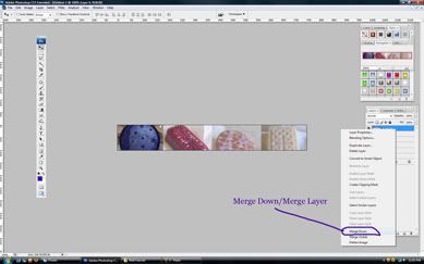
Now here is the cool part about saving out both banners at the same time and stacking them on top of each other. When you crop down the banner it will be perfect two times which means our size will remain. In other words you can toggle off the eye switch to see the layer below and and save it out keeping everything the same size.
How ever make sure to save them out as the word on them followed by one and then the second one should be the name and followed by two. In my case mine will be saved out as homeone.jpg and hometwo.jpg
img src="http://i688.photobucket.com/albums/vv249/clemartutorial/29.jpg" border="0" alt="29">

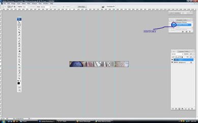
A cool tid bit. While using this form of cropping your banner all you have to do is go back in your history to before you cropped it and simply move on to the next section and crop and then repeat the process.
To open your history panel if it isnt open go to "windows > history"
28

Thats it for today. Make sure you save everything out and get it all perfect for tomorrows day in dreamweaver.Here is your badge for the day!
badgecutting

Friday, February 27, 2009

Requested Tutorial Day One

Last month Inkihandmade put in a request for me to show how to build a website. Which is a huge request. Lol, especially for one blog.
Warning!!! If you have not done my other tutorials or are not familiar with photoshop this will sound like nonsense. Take the time to do my other tutorials if you have not.
So I figured out a way to do a many tutorial but it would span into next month oddly enough and take over the tutorial that month so for all of you I present:
Web Design mini-course:

HeathensHearth was awesome enough to let me use them as a guinea pig for this little experiment so here are the files for you guys!

c


bc

w

p

Alrighty first step is to:
Make a new folder on your desktop background:

1

Next make two new folders inside of that folder:
2

Name one source and one images.
Your source files will contain things like your photoshop files or flash files. Your images files will contain all jpegs, gifs, and whatever have yous.
3

After we get that all squared away lets open up photoshop and create a new document. The measurements for this document should be 750x100. Which is about 10 pixels short of an etsy banner:
1

From here lets create a new layer and get all of our other files open. You can do this by:
a. going through file>open>"file name"
or
b. drag and drop the files into photoshop
Photobucket

Now that we have our files open lets drag them into the open photoshop document. If you are unfamliar with this step see my other tutorials:
Photobucket

From here lets close all those other guys out and save this booger. We are going to save it in the "source" folder we created earlier under "banner" After that lets start changing the size of these layers.
You can do this by(from layer sizing tutorial)
a. hitting ctrl+t and clicking and dragging
or
b. going into edit>free transform>and dragging:
Photobucket

After we get everything sized the way we want it lets merge those layers to save on some space.
You can do this by
a. hitting ctrl+e
or
b. right clicking on the layer and selecting merge layers:
Photobucket

If you like the way everything looks from here you can skip the next two steps. I personally love to add on a bit of texture to things so I make a duplicate of the layer
You can do this by
a. right clicking on the layer and selecting "duplicate layer"
or
b. clicking on layers at the top and selecting duplicate
Photobucket

From here we select "Filters" from our top bar of photoshop. You can randomly pick anything you like. Photoshop allows you to change the option inside of the setting.
Photobucket

From here I personally select "Paint Duabs" like 98% of the time. I can toggle the numbers to change the size of my brush or the amount of detail I have.
Photobucket

After that I hit okay and head back into photoshop. I go to the opacity button and change the number (from my watermarker tutorial)This gives the layer more texture and feel and it doesnt just look like plain pictures but works of art.
Photobucket

Okay make a new layer and select the shape tool. For this particular exercise we are using the rectangle tool but if you prefer to use a funky shape be my guest but it will hurt you in tomorrows portion.
Photobucket

Now from here you can leave it whatever colored you made it or change it with styles. I have a huge library of styles and some of you might. So for this tutorial you might have to stick with a basic color. If you have a ton of styles this will be a snatch for you.
If you dont have a styles panel open go to "window>styles>and select it" from there your styles panel should open.
Photobucket

Depending on what you decide to do it really doesnt matter but for this step we are going to duplicate the layer with our shape on it to make sure that we have the exact same shape in the exact same position. This will come in handy for our navigation of the website. After you have duplicated the layer if you are using styles you can select a new style or if you are not you can just use the paint bucket tool and change the color.
Photobucket

From here we want to select the text tool. Pick a font you like and add words to the bar we just created. The easiest way is to just line up the words with the picture. So pick 4 words and lets get those babies on our page:
Photobucket

Notice that I created a new layer for all of the text. This allows me to move everything by piece instead of in a huge layer that I might need to edit later due to spelling or me not favoring one thing. If you put the text on separate layers it will also help you.

Photobucket

From here lets select all of those text layers we just made (or for some people layer) and right click on them and hit duplicate.
If you dont know how to select several layers you can:
a. click one layer and the hold the shift button and select the others
or
b. Just drag around the layers and select them all
Photobucket

Once we get those guys duplicated lets change the color of the text. This will help us also when it comes to creating separate forms of navigation.
Photobucket

From here lets do a nice toggle on our layers. Lets turn off the eye on our original text layer and on one of our layers that has the rectangle(our shape that you picked) and see how our navigation system looks. The one that is all of your original text layers and rectangle that you turn off can be used to represent our inactive buttons (will explain tomorrow) and our active buttons will be the reverse. Look at this combination's now and decide if you like them or not.From here we can add the name of our site. In this case I used "Heathens Hearth"

From here I personally find the text hard to read so I add a white rectangle behind it and fade it to make my text more readable. Depending on what you have done and your color choices you can toggle or mess around until you feel safe with your choice.
Photobucket

From here its just saving out. Now remember that you turned some layers off and on. Keep this combination and lets got to file>save for web or devices
or in older versions of photoshop its
file> save for web
and in even older versions of photoshop
you have to flatten you image
Photobucket


Take a look at your panel on the right hand side and make sure it is set to "jpeg"
Photobucket

Now take a second look and also make sure that it is set to maximum.
Photobucket

If thats the case then remember your toggled choice and name it either "active banner" or "inactive banner" this will save us time on issues we will run into when saving out tomorrows stuff.Also these guys go in your "Source" folder for now.
Photobucket


Okay the good news is this porition of the tutorial is over.
banneractive

active

The bad news is tomorrow it gets more wordy. If you had trouble following any of these steps let me know and I can try and help you out as much as I can. Tomorrow I have a ton of running around like a chicken with my head cut off to do so I will upload bigger files to my website for all of you who cant see. Today you have successfully made your navigation here is your badge to put on your blog for completing this tutorial:

bannercomplete